Creating and managing custom dashboards

Analytics is an embedded reporting tool that allows you to create, monitor, and export live dashboards that visualise data about your grants.
This article delves into creating your own custom widgets and dashboards from scratch. If you have not yet explored the default dashboards available, please do so.
Table of contents
Deciding what you would like to report on
Tip: When designing your dashboard, identify what is it that you need to know, where and how the relevant data is stored, then build your dashboard widgets with the correct fields.
Prior to creating a custom Analytics dashboard, consider the following:
What are the overall questions you would like answered about your grant program? Each question could likely be a separate widget in a dashboard.
What data is present in the system and reliably collected that would help answer your questions?
What might be the ideal format for the data to be visualised? I.e. a table, a bar chart, pie chart, etc.
Where exactly is the relevant data located in the system? For example, is it a standard field, a question response in a form, or general budget information? What is the exact label of the field so that you could locate it accurately when browsing the Analytics field selector?
Lastly, what format does the data take? Is it numeric, a text response, or something more complex like a multiple choice question?
Below are two example scenarios of how you might reflect on the above questions before creating your custom dashboard:
“I want to know about the demographics of our applicants. Our application form collects applicant gender as a single choice question. However the question is also a standard field, so I can get the data from the standard field tab rather than the application form. I know the label of the standard field, and it is located under our ‘Project Essential Details’ category. Now that I know where the data sits, I can create a widget based on this field, and perhaps visualise it as a pie chart. Then, I will be able to understand the proportion of my applicants who chose each gender option.”
“I want to know how our funds are being spread over different causes. We collect Project Subject for each application, and it's stored as a smart choice standard field. We also record payments made against each application via the Payments tab. Smart choice data is complex, because one applicant might select multiple options. So I should look out for this when creating my widget and consult the Help Hub. By combining this data in a widget, I could create a table listing each individual Project Subject, with the total amount paid to applications that selected that subject alongside it. I could then see the distribution of funds to different topics.“
Important concepts
The data model
Analytics allows you to report on certain data in the system. The underlying data available is stored in various tables that are linked together in logical ways. Not all tables in SmartyGrants Analytics can be used together in a widget. In some cases, the relationship between tables may mean that no results will be displayed.
The data model is pictured below. It is a visual representation of the data that is available for reporting, the tables the data is divided into, and how they relate to one another. The data model is dynamic and expands with the creation of new standard fields, standard sections, smart choice questions, and when switching on forms for reporting. The data model is the source of truth for Analytics, and we recommend familiarising yourself with it.

This help article provides common language guidance on combining tables to produce expected results. It does not reference the data model in great depth from a data science perspective. For more detail on this including accurately determining which tables can be combined in analysis, please consult the technical documentation attached to the base of this article.
Tip: Refer to the Analytics Data Dictionary for an Excel file that lists each reportable field (i.e. each field in the data model tables) alongside its definition. The file is attached to the base of this article.
Data refresh rules
It is important to be aware that certain information in analytics won't reflect in your widgets until the next day. Dynamic data, which includes form responses, standard fields, and standard sections, is refreshed on a nightly basis. Practically, this means that:
If you enable analytics for a form, existing responses to the form won't appear in Analytics until the next day.
Furthermore, new responses to the form won't appear until the day after they are submitted.
If you make a change to a form for which analytics is already enabled (e.g. removing a question, or adding a standard field), these changes also will not be reflected in Analytics until the next day.
Choosing a ‘Limit to’ filter
For your widgets to display accurate data without duplicates, every widget requires a “Limit to <Entity>” field applied as a widget filter.
To select the correct “Limit to” filter, consider the entity being described by the field that the widget is aggregating (i.e. summing, counting). The entity being described is usually in the name of the table that the field comes from. Refer to the data model for details of the tables. For example, if a widget is summing Original Amount Approved from the Application Financials table, select “Limit to Application” for the widget filter.
Warning: If you do not apply the correct limit, your sum or count total may be inaccurate.
Other examples include:
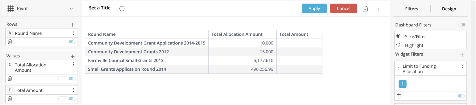
“I would like to find, for each round, the average funding allocation amount given to application.”
This widget would average the field “Allocation Amount” in the Funding Allocation table. It would then split this data by “Round Name” in the Round table.
It is averaging “Allocation Amount,” a field that gives information about funding allocations. Apply “Limit to Funding Allocation” from the Funding Allocation (Limit) table as a widget filter.
“I would like to sum the total amount paid to applications from each program.”
This widget will aggregate “Application Total Amount Paid,” a field that gives information about applications. Apply “Limit to Application” from the Application (Limit) table as a widget filter.
“I would like a list of applications that have received a funding allocation from each budget.”
Even though Database Application ID comes from the Application table, creating a list of applications that have received a funding allocation technically involves listing the Application IDs of funding allocations. Select “Limit to Funding Allocation“ from Funding Allocation (Limit) as the widget filter.
Note that selecting “Limit to Payment“ from the Payment table as the widget filter would return applications that have received a payment.
Applying a ‘Limit to’ filter
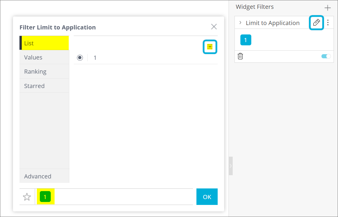
Open up your widget to enter the Advanced Configuration.
Locate Widget Filters on the right-hand side, and select the plus ( + ) icon.
Search for your limit, e.g. Limit to Application, Limit to Payment, etc.
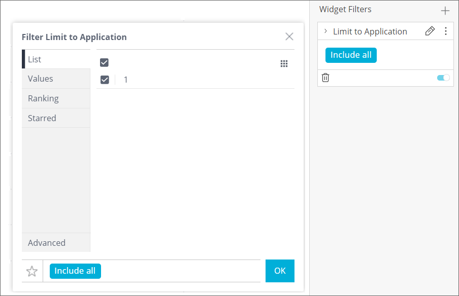
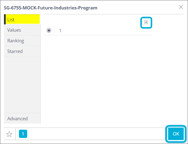
Your limit should always equal 1. You must select the grid button indicated to change the result to a single choice. Then select OK to apply your filter.
Reporting on standard fields
Standard fields are organised in the data model by the category they are under. Standard fields do not need to be turned on the way forms do, and are available in Analytics by default. If you are not familiar with standard fields and categories, please refer to the Foundational Help Hub.
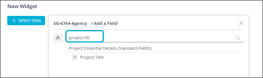
When building a widget, the easiest way to find a standard field is to simply type its label into the field selector:
For more in-depth information about reporting on standard fields, and how they are stored in the data model, please consult the technical documentation attached to the base of this article.
Note that archived standard fields are not included in Analytics reporting.
Reporting on standard sections
If you are not familiar with standard sections and their grid structure, please refer to the Foundational Help Hub.
When building a widget, the easiest way to find a field from a standard section is to simply type the section label or the question label into the field selector.
Standard sections also share other reporting characteristics as per standard fields:
Standard sections do not need to be turned on for reporting and are available in Analytics by default.
Archived standard sections are not included in Analytics reporting.
For more in-depth information about reporting on standard sections, and how the data is stored in the data model, please consult the technical documentation attached to the base of this article.
Warning: It is not recommended to combine fields from multiple different sections in a single widget. This includes combining fields from multiple standard sections in a single widget, or combining fields from a standard section and a repeating section in a single widget. Combining them can lead to misleading/nonsensical duplication of values. Refer to the technical documentation attached to the base of this article, for an explanation on why this is the case.
Reporting on form responses
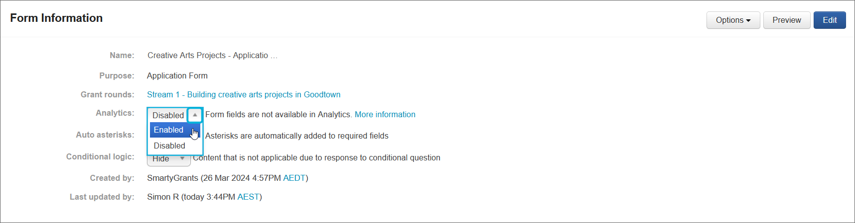
You will likely be primarily reporting on standard fields in your dashboards. However, sometimes, you may wish to report on form responses instead. You can use Analytics to report on responses to application, assessment, acquittal, administration and variation forms. However, form fields only appear in the Analytics field selector for forms that you have enabled reporting on. They do not appear automatically. Further, due to the nightly data refresh, a form enabled today will appear in analytics tomorrow.
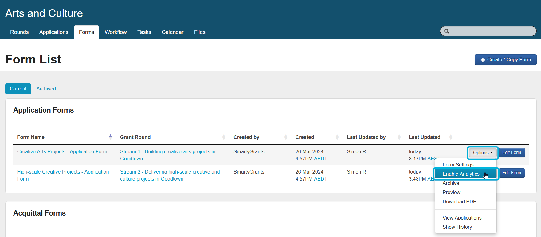
To enable/disable reporting on a form, go to the Forms tab, select Options for the form you want to enable reporting on, and toggle between Enable Analytics / Disable Analytics.
Alternatively, you can enable/disable Analytics within the Form Settings (Options > Form Settings) by toggling the dropdown next to Analytics between Enabled / Disabled.
Important: Do not enable forms for reporting if they are not required. There is a limit on how much data you can enable for reporting, and the system will warn you if you are approaching (or have exceeded) the limit.
When building a widget, the easiest way to find a form field is to simply type the question label into the field selector. Consider a question with the label Brief Project Description in a form titled Small Grants Form. If this question was also a standard field, then you would see the question listed twice in the field selector:
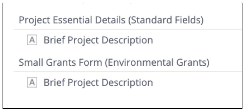
Select the first option to select the standard field data, and the second option (that comes under the form name) to select the form response.
Reporting on multiple choice standard fields/questions
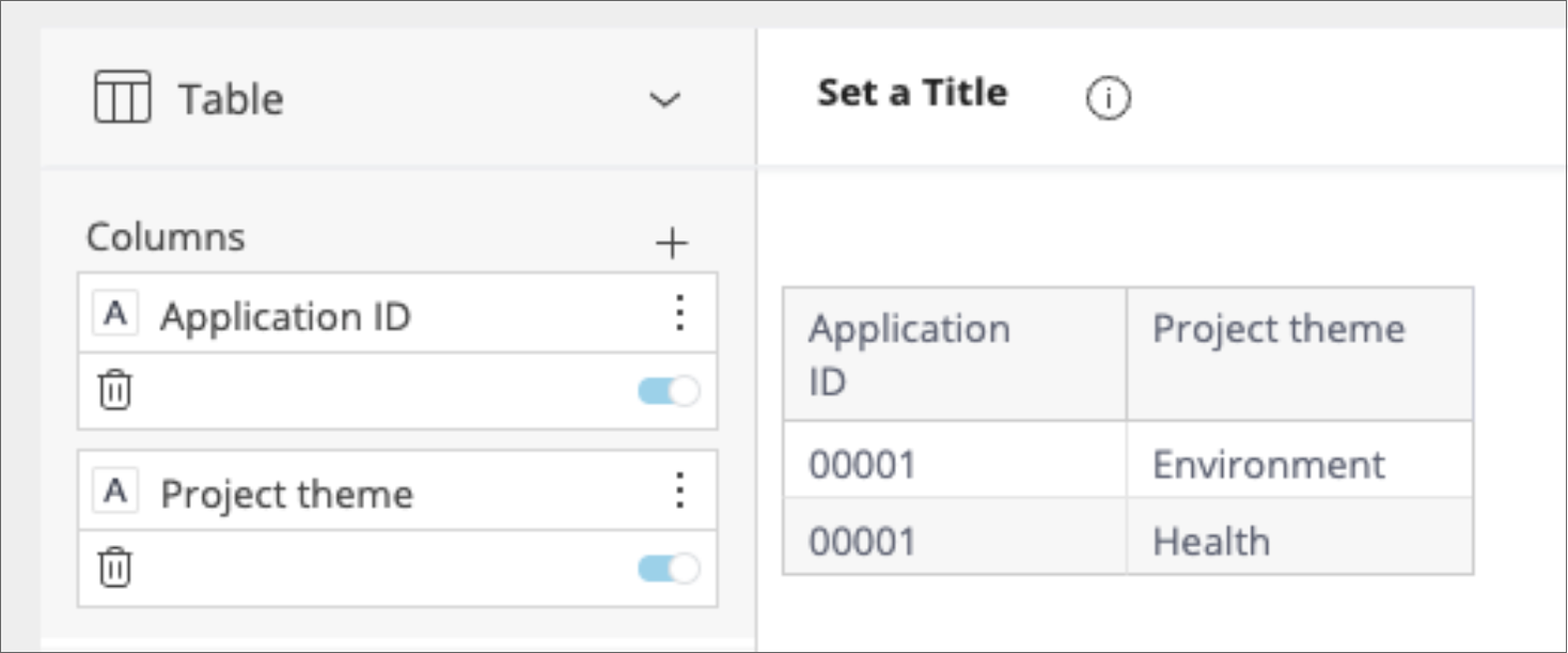
When selecting a multiple choice question from the field selector, you will notice the question appears under two tables or headings. This is because there are two ways to consider multiple choice data, and you need to choose the one that suits your analysis. See the example multiple choice question below with the label Project Theme:
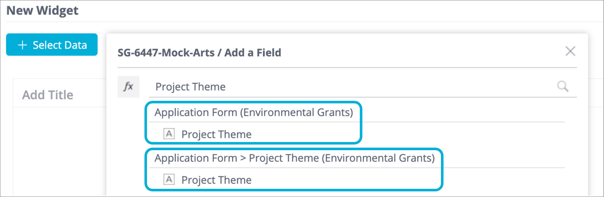
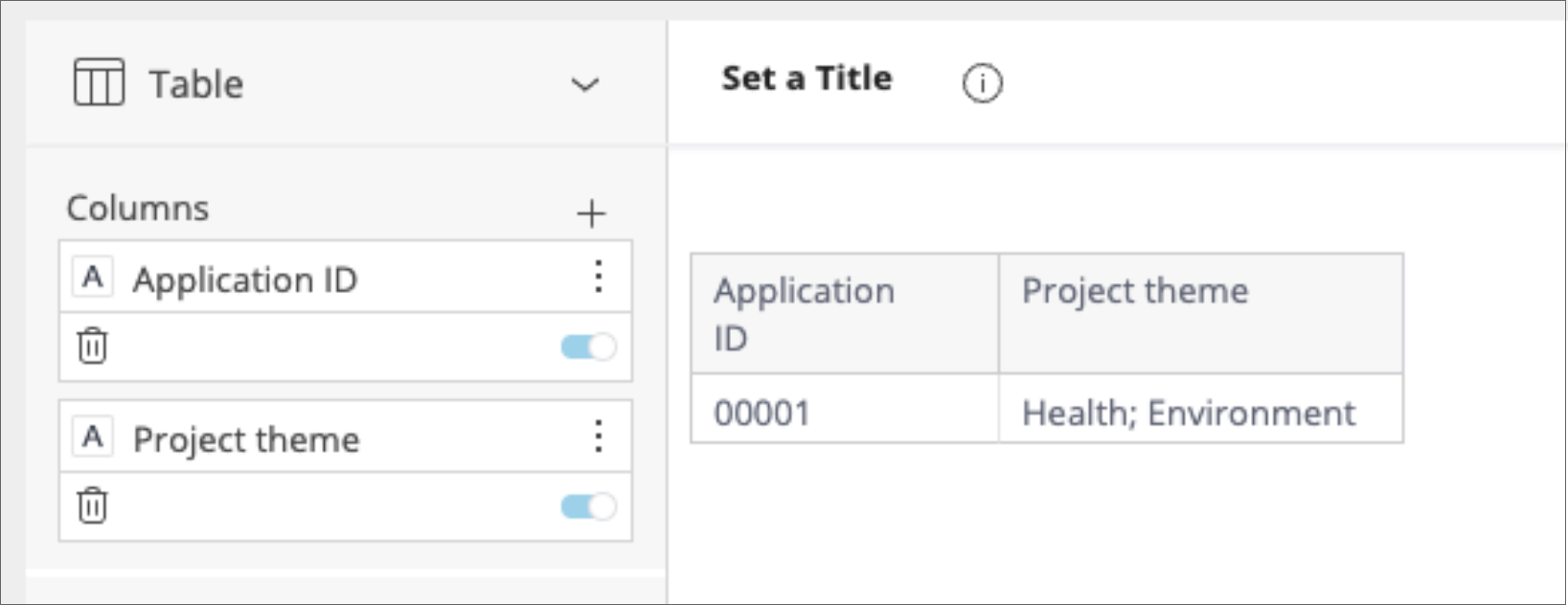
Select the first option if you would like to report on combinations of answers. E.g. 'How many applicants chose both health and environment as their themes?':
Select the second option (that has the field label included in the heading) if you would like to consider each selection individually. This is important if you would like to group total counts. E.g. 'How many applicants in total chose the environment as one of their themes?':
Reporting on smart choice standard fields/questions
If you are not familiar with smart choice lists and their layered hierarchy, please refer to the Foundational Help Hub.
Responses to a single smart choice standard field are split across up to five separate tables in the data model, representing the hierarchical nature of smart choice responses and the various ways to report on the responses to them. These include one table for each level in the smart choice hierarchy (each with one field “Category”, “Level 1”, “Level 2”, “Level 3” respectively) and the summary table (with fields “Selected Value” and “Selected Value Level”). If you utilise multiple smart choice standard fields, each smart choice standard field generates a separate hierarchy of up to five tables.
See an example below of a smart choice list titled Logo Colours under the section category Branding:
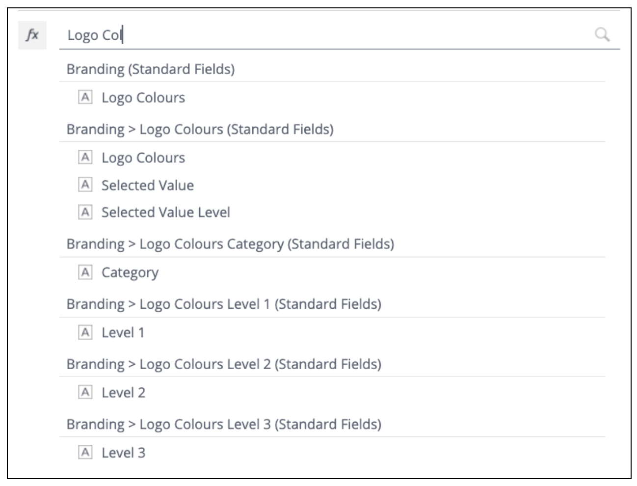
There are various options to pull out the data. See an example output of the various options below. Some pull out the whole string, and others just output the lowest selection (Level 3), or the broadest selection (Category). You might like to output all the options to start, and then choose the option that suits you to report on.

Please consult the technical documentation attached to the base of this article, for further detail on this topic.
Info: Smart Choice ordinary questions (non standard fields) in form responses do not generate a hierarchy of separate tables, rather the question response is stored as a whole string.
Warning: Smart Choice templates need to contain only non-overlapping hierarchies:
SmartyGrants smart choice templates are designed for non-overlapping hierarchies, where a choice can only ever be nested under a single choice at the higher level.
An example of a non-overlapping hierarchy could be Food Group>Sub-group, where the choices for Food Group are “Animal-based” and “Plant-based”. Sub-Group choices nested under “Animal-based” are “Meats and Poultry”, “Dairy” and “Fish.” Sub-Group choices nested under “Plant-based” are “Fruits” and “Vegetables.” Under this hierarchy, selecting “Fruits” implies only one possible Food Group.
An example of an overlapping hierarchy could be Seniority>Gender, where the choices for Seniority are “Executive”, “Middle-management” and “Junior.” All three of these Seniority groups nest the Gender options of “Woman”, “Man” or “Other”. Under this overlapping hierarchy selecting “Man” implies multiple possible seniorities.
Inputting overlapping hierarchies into a smart choice template may lead to duplication (inflated figures) in the reporting tool. This duplication can be resolved through a calculated field in the widget builder, but non-overlapping hierarchies are encouraged to minimise unexpected results.
Reporting on the Outcomes Engine
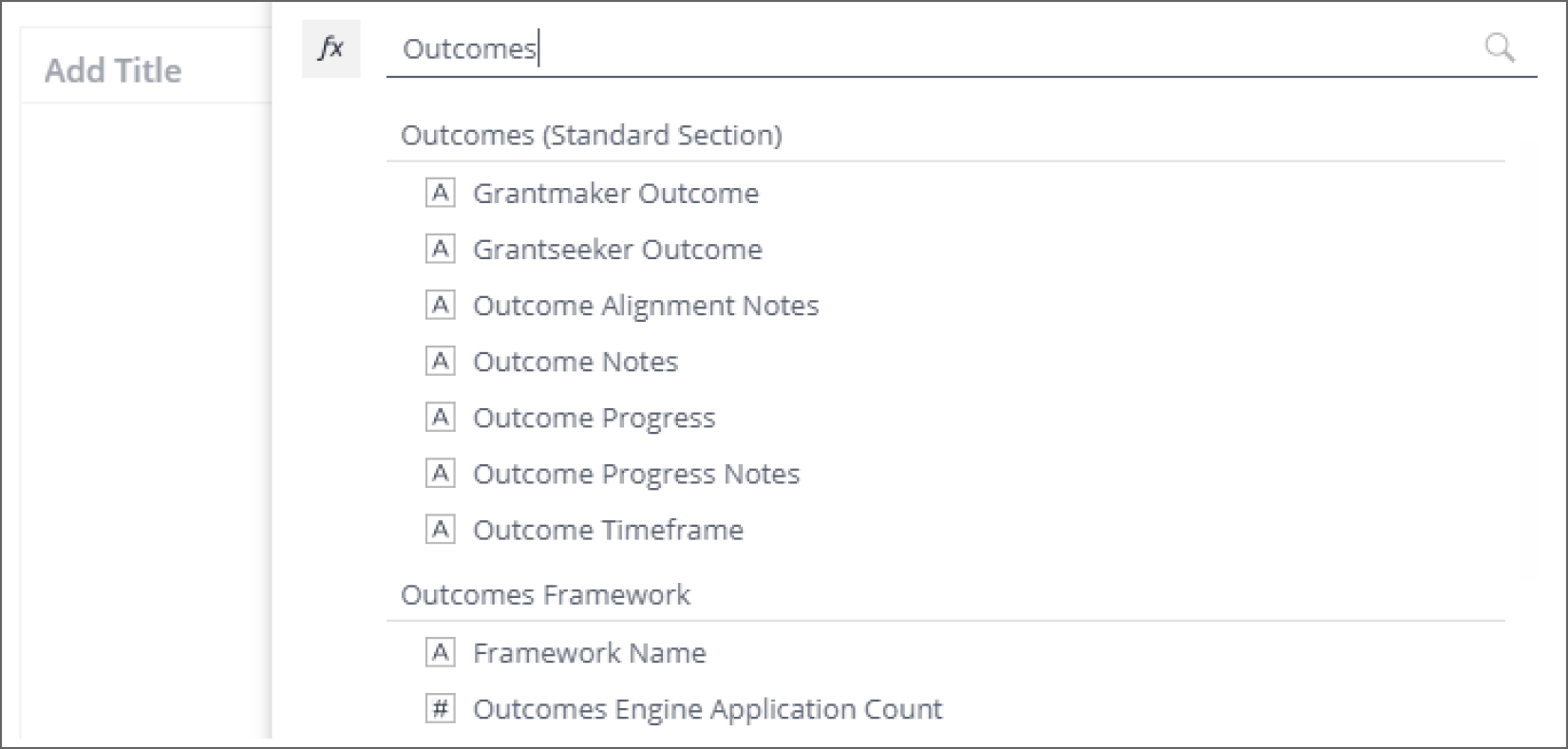
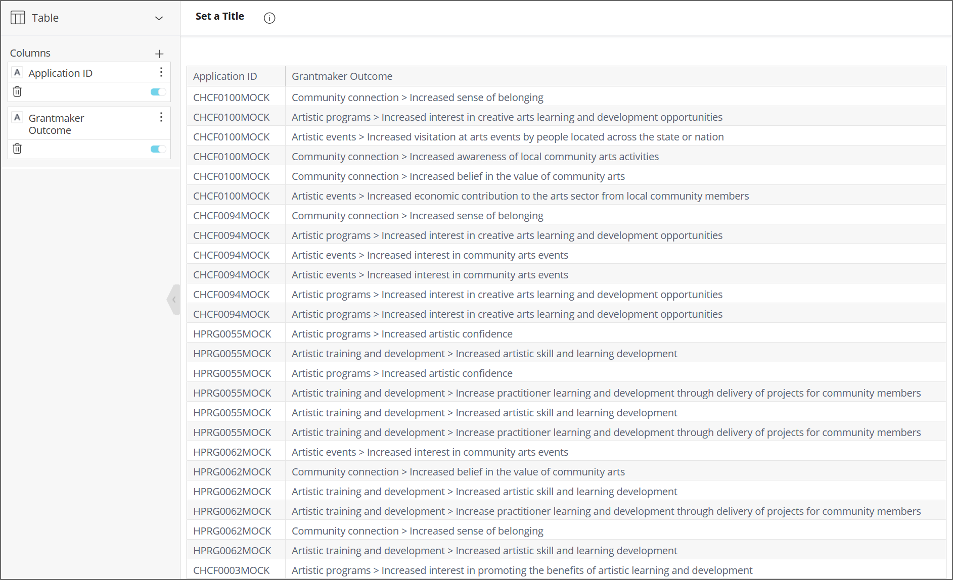
Several tables in the field selector are relevant to reporting on outcomes depending on the format and breakdown of the data that is required. For a basic analysis, search for ‘Outcomes’ in the field selector and review the fields available under the ‘Outcomes (Standard Section)’ table:
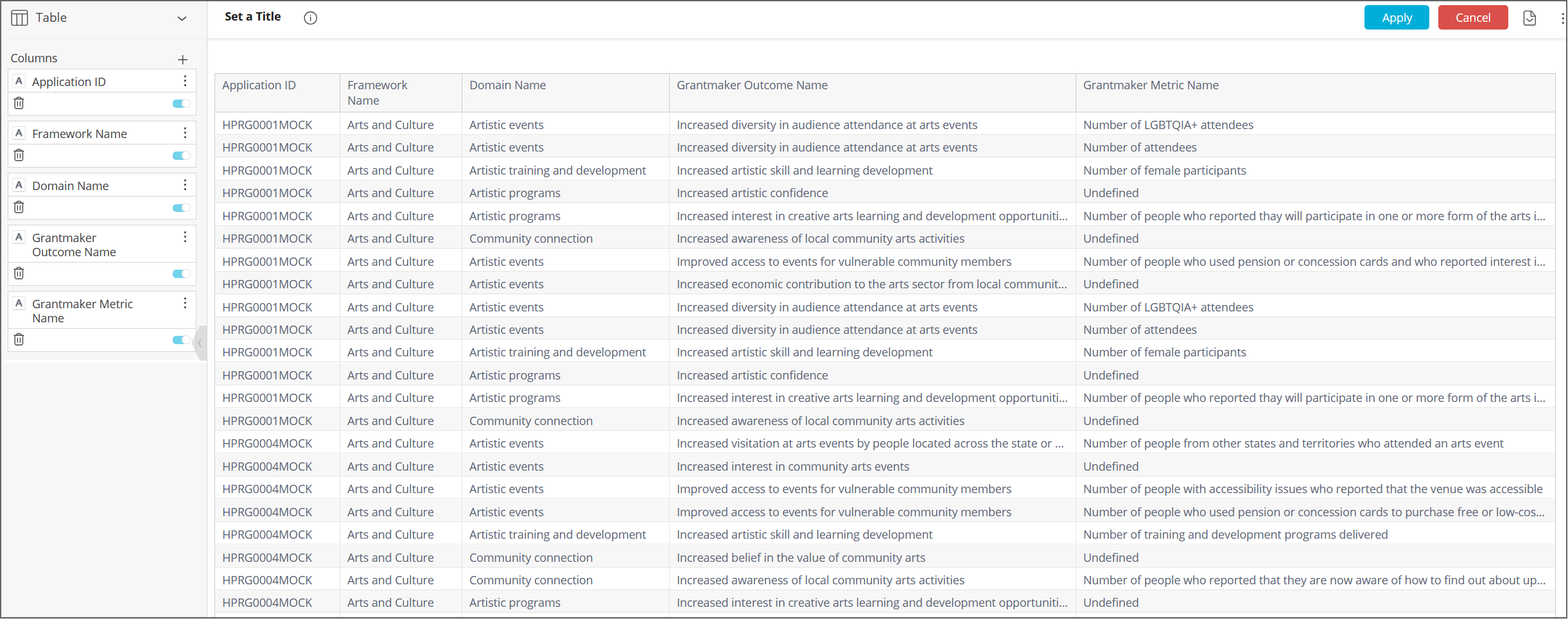
Selecting the field labelled 'Grantmaker Outcome' under this table will return responses as concatenated strings in the structure of domain > outcome > metric. For example:
If you would like to group data by domain, outcome, or metrics in a non-concatenated form, there are four alternative tables in the field selector that are applicable:
Outcomes Framework: contains the field ‘Framework Name’. Outputs the name of the framework relevant to each application. Useful if you have multiple outcomes frameworks across your programs.
Domain: contains the field ‘Domain Name’. Returns the applicable outcomes domain.
Grantmaker Outcome: contains the field ‘Grantmaker Outcome Name’ to group by outcomes selection.
Grantmaker Metric: contains the field ‘Grantmaker Metric Name' to group by metric selection.
See example results for these fields below:
This grouped data can be useful for financial analysis to answer questions such as ‘How were our funds distributed between each domain/outcome/metric?’.
If you are not familiar with Outcomes Engine fields and what they capture, please see this article. You can also find pre-built Excel reports that visualise outcomes data here.
Tip: For the best understanding of the difference between the reportable outcomes fields, create a table widget that uses them all and compare the data visually.
Info: If an outcomes framework does not make use of domains (which are optional), outcomes will be attached to a domain 'Undefined'. Grantseeker Outcomes not linked to a grantmaker outcome in the Outcomes standard section are linked to a domain 'Not selected' and a grantmaker outcome 'Not selected'.
Reporting on unselected domains/outcomes/metrics
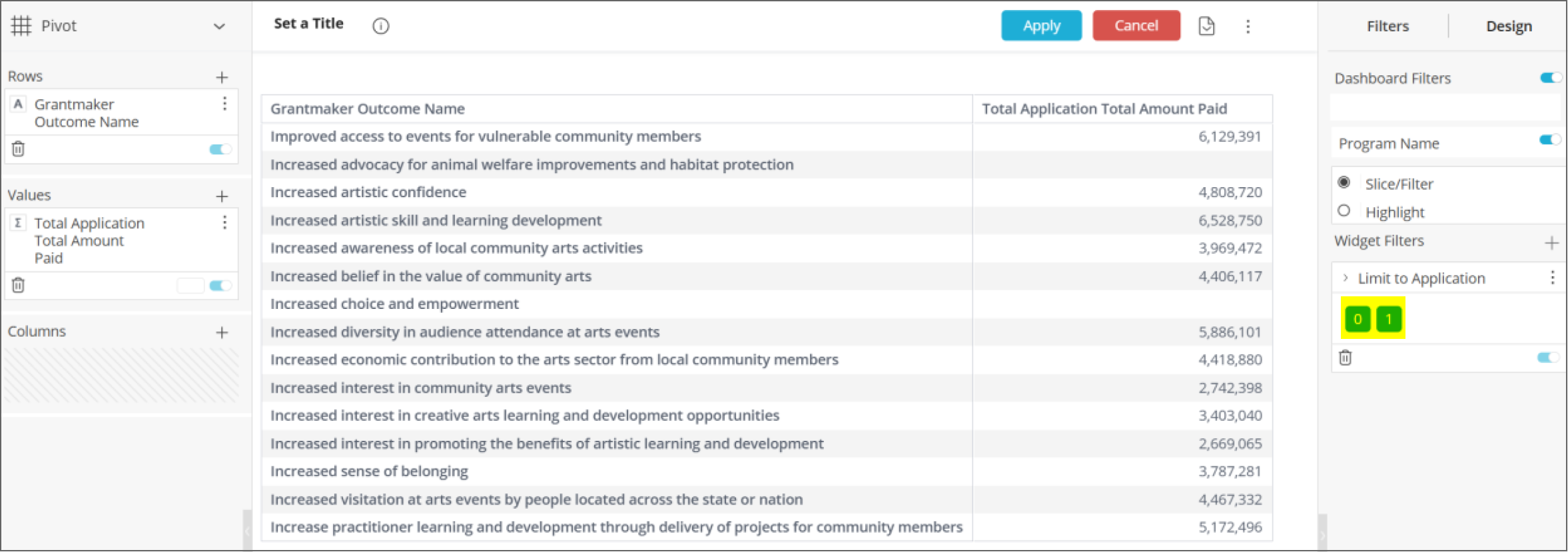
By default, the static outcomes tables will exclude domains, outcomes, and metrics that have not been selected by any application.
To include unselected domains/outcomes/metrics in a widget, set 'Limit to Application' to equal 0 or 1 (instead of the usual default of 1):
If you would like to assign an application count to the unselected domains, use the field 'Outcomes Engine Application Count' in place of Application ID, as the former field is compatible with this negative analysis, and the latter is not. You can also use 'Outcomes Engine Application Count' to filter data in widgets to applications that have used the Outcomes Engine (that is, answered an Outcomes Engine standard field.) To do this, use 'Outcomes Engine Application Count' as a widget filter and filter for '1'.
Categories, Values, and Break by
When building charts, there is usually a Row / Columns / Categories box (depending on the chart type), a Values box, and a Break by box for dragging fields into. In general, you will drag fields for grouping and categorising into Row / Columns / Categories / Break by boxes. You will generally drag fields used for aggregation into the Values box. However, this is just a rule of thumb. For example, you could drag Funding Source into the Values box to count how many funding sources exist in an account.
Worked example: creating a dashboard
Dashboards are a collection of widgets that provide an overview of the data you care about. A widget connects to your data and presents it in the visualisation style that you configure.
An example is provided below for creating a ‘Current Rounds’ dashboard comprising 2 widgets. We suggest following along to get familiar with using the tool. The data shown in this example is mock data and does not reflect your actual data.
Widget 1: Total amount allocated per round in a pie chart
Select the + sign followed by New Dashboard or the To Create Your Dashboard Click Here button to start the process.
Select your Data Source (scroll down if necessary). There should only be one data source available for each account.
Give your dashboard a Title such as Current Rounds.
Select the Create button.
Under New Widget select the + Select Data button.
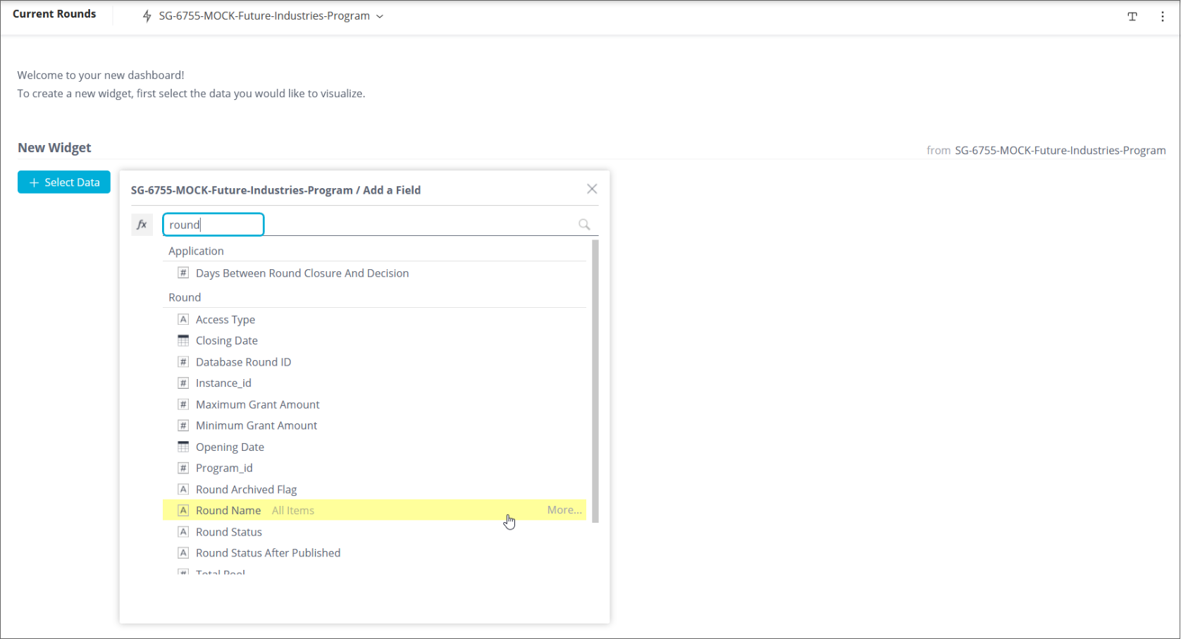
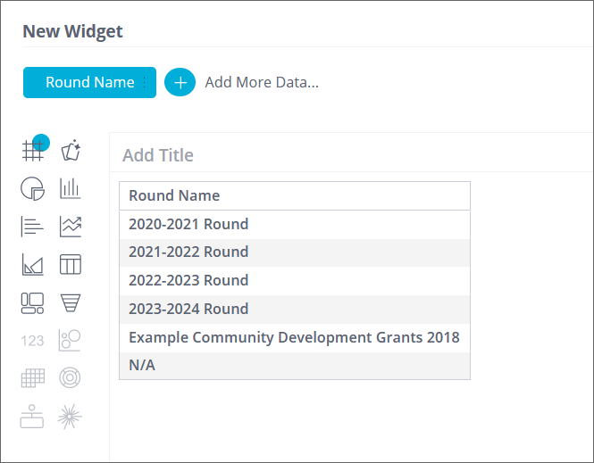
Enter round and select Round Name from the Round table.
A list of all Rounds in your account will be displayed:
We want to add another data point for the Total Amount Allocated for all applications received. Select the + Add More Data... to add another data point.
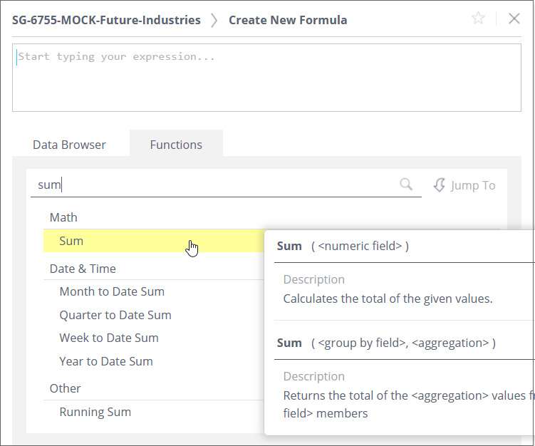
To get a total per round of the Total Amount Allocated for each application, select the fx function icon, then select the Functions tab, then select Sum (you could also type in the name of the function and select it):
Then select the Data Browser tab to search for the Application Total Amount Allocated attribute from the Application Financials table:
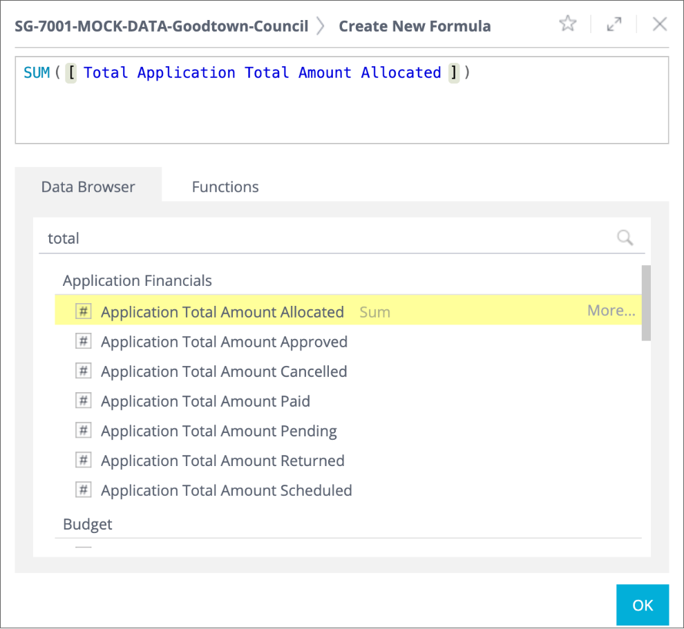
Select the OK button.
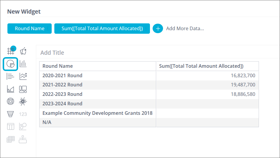
Currently, the widget is a Pivot table showing the Sum of the Application Total Amount Allocated for each round. Note that there is nothing yet allocated for the 2023-2024 Round. There is also an Example Community Development Grants 2018 round and a N/A which we will filter out later by applying a ‘Limit to’ filter:
Let's change it to a Pie chart by selecting the pie icon highlighted in the above screenshot.
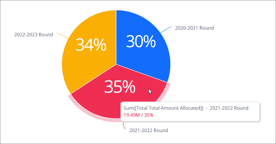
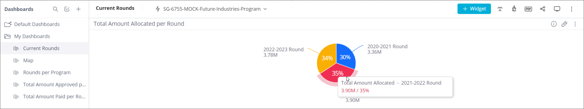
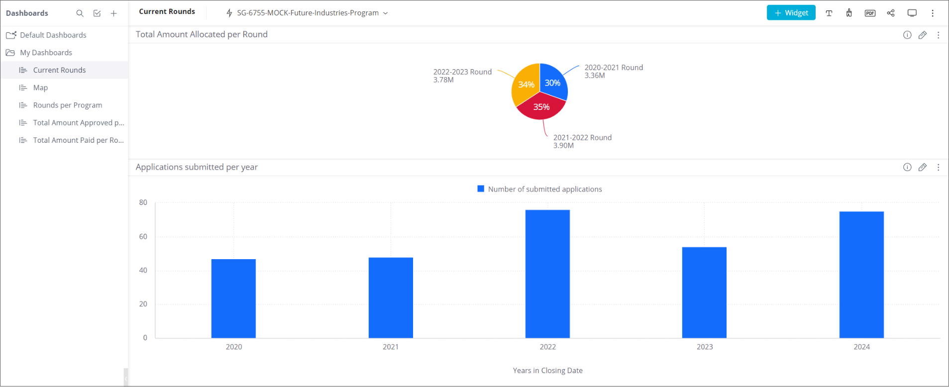
The pie chart now shows each round with its summed-up Total Amount Allocated from all of its submitted applications expressed as a % of the summed Total Amount Allocated from all the applications in the account. Hovering over each segment shows the name of the round, the summed Total Amount Allocated, and the % value of the round versus the account.
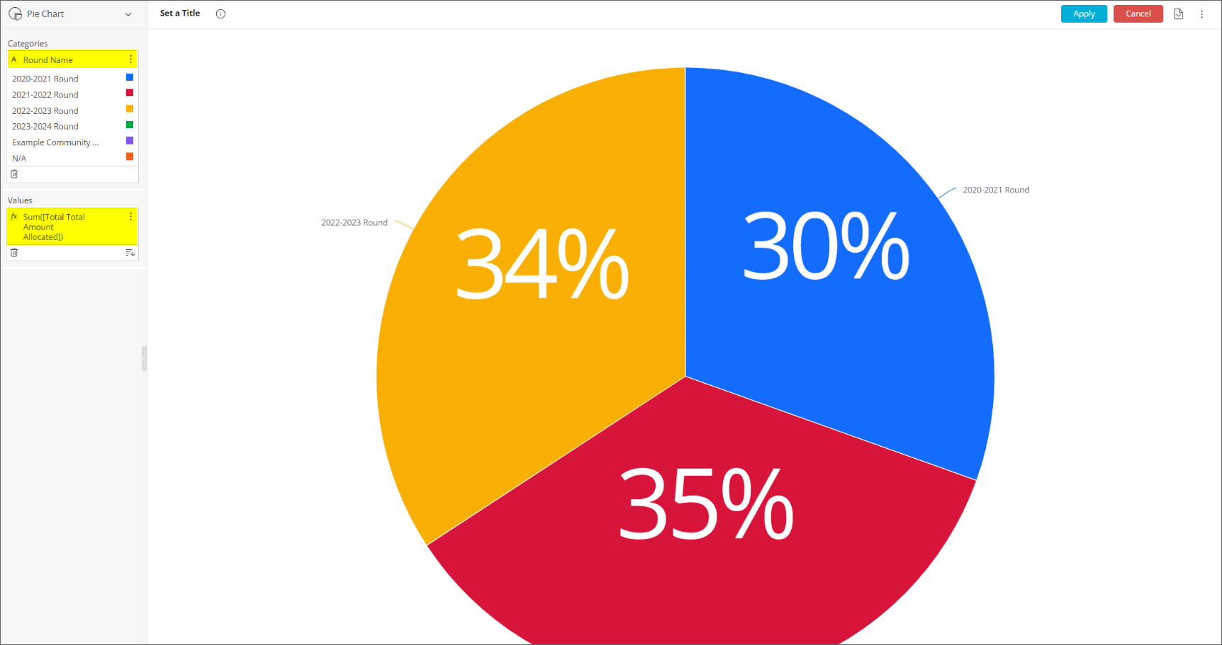
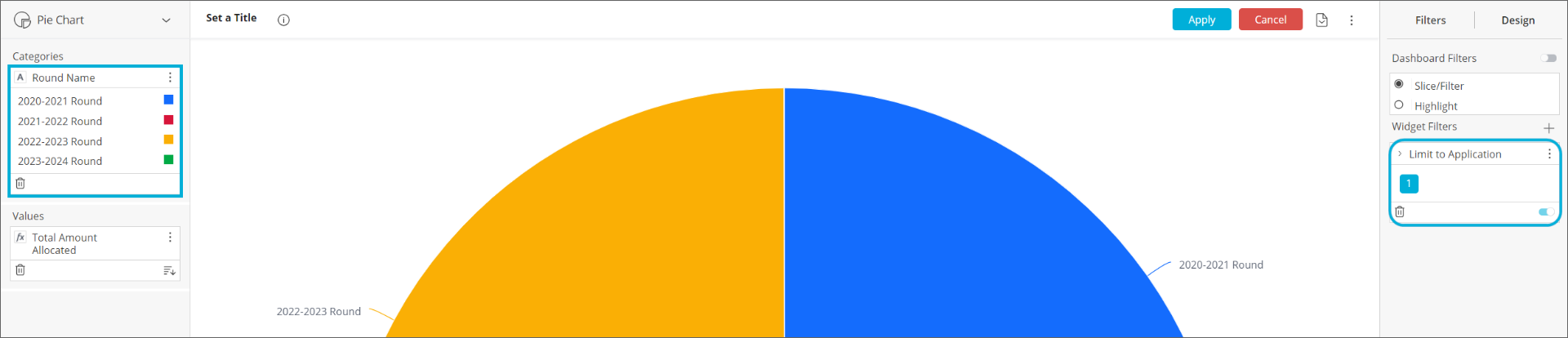
Selecting the Advanced Configuration link at the bottom left of the graph shows the chosen attributes (Round Name + Total Amount Allocated) in the Categories + Values boxes, respectively, in the left-hand pane:
Note that we could have achieved steps 9 + 10 above by simply selecting the Advanced Configuration link and selecting the + icon in the Values box, and selecting Total Amount Allocated without the need to select the fx icon and then the Sum function. The steps 9 + 10 were used in this example to illustrate the available functionality.
Within the Advanced Configuration screen, hover over the Sum([Total Total Amount Allocated]) in the Values box and select the menu icon (3 vertical dots) and the Rename option. Rename this to Total Amount Allocated.
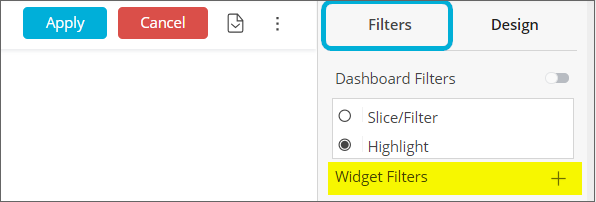
To apply the Limit To filter to filter out the rounds without any applications, select the Filters tab (top right corner), and select the + sign next to Widget Filters:
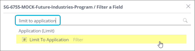
Type in limit to application and select the Limit To Application filter from the Application (Limit) table:
Select the List tab and then the 9 dot icon  , and OK, to apply the Limit To filter:
The Limit To widget filter is now limiting the rounds to those having at least 1 application:
In the right-hand column, selecting the Design tab, allows you to refine the look of the chart, for example changing the Pie Type, modifying the displayed Labels, or adding a border/background colour to the widget.
Select the Set a Title at the top, to give the widget a title. Enter Total Amount Allocated per Round.
Select the Apply button at the top to apply the configured widget to the dashboard:
Widget 2: Applications submitted per year in a column chart
Select the + Widget button to start configuring a second widget for our dashboard.
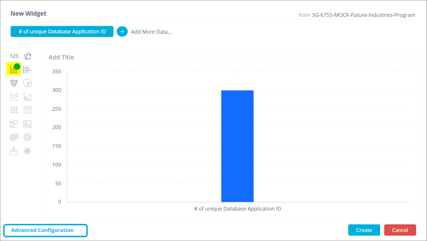
Select the + Select Data button, then enter database application and select the More… link to the right of Database Application ID and select |#| Count Unique:
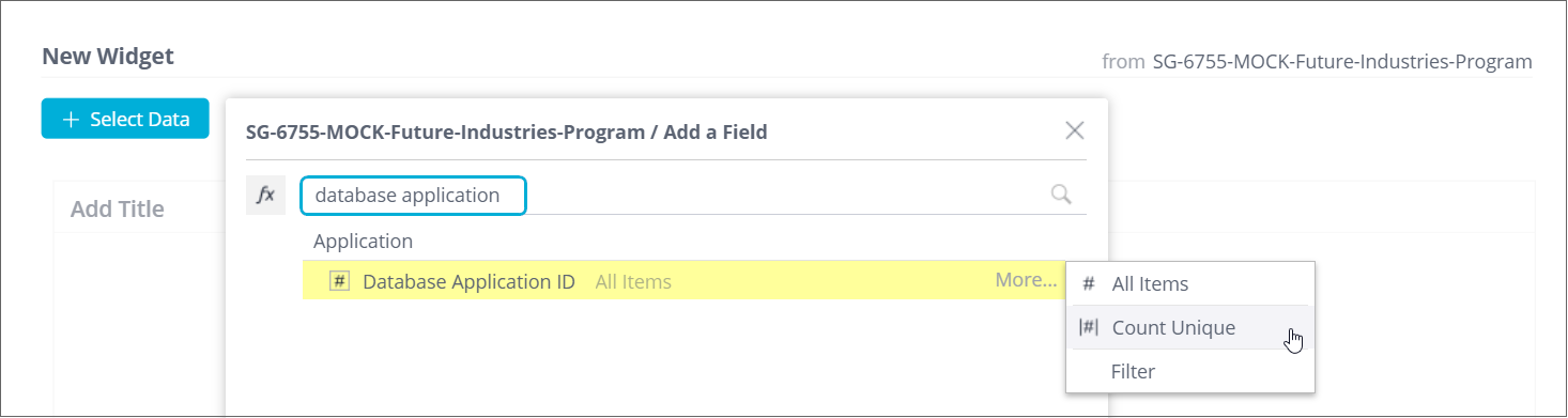
Now we have the number of unique Database Application IDs in the account.
Change the chart type from Indicator to Column Chart (the icon below Indicator).
Now we have a column chart with just a single column:
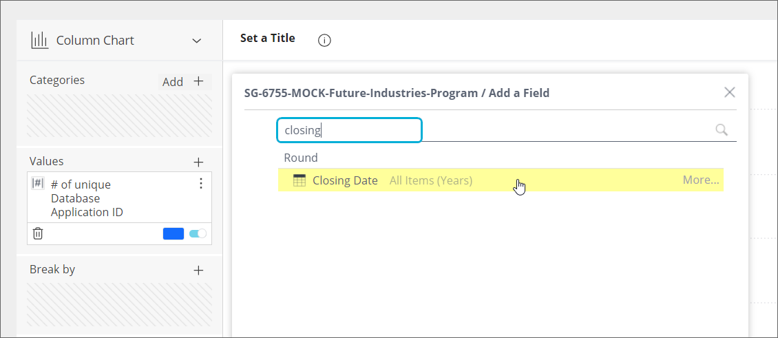
Select the Advanced Configuration link at the bottom left of the graph, highlighted in the above screenshot.
In the Categories box, select the + icon to add the round Closing Date attribute from the Round table:
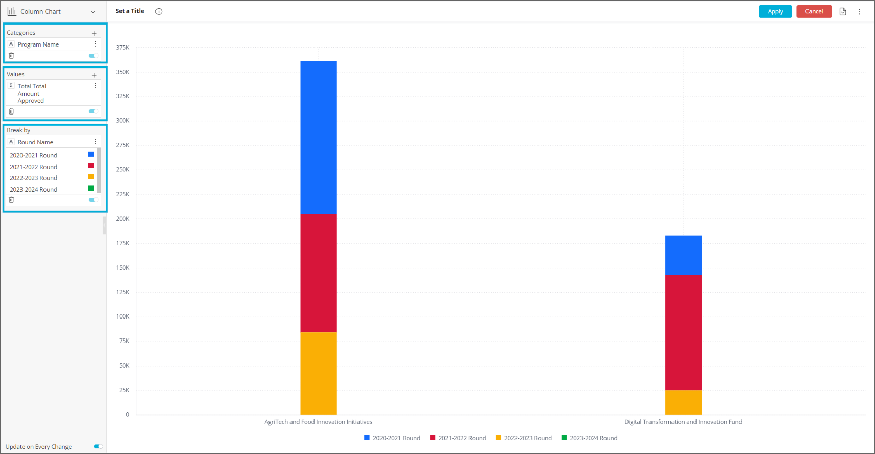
Now we have multiple columns, showing the number of applications submitted per year:
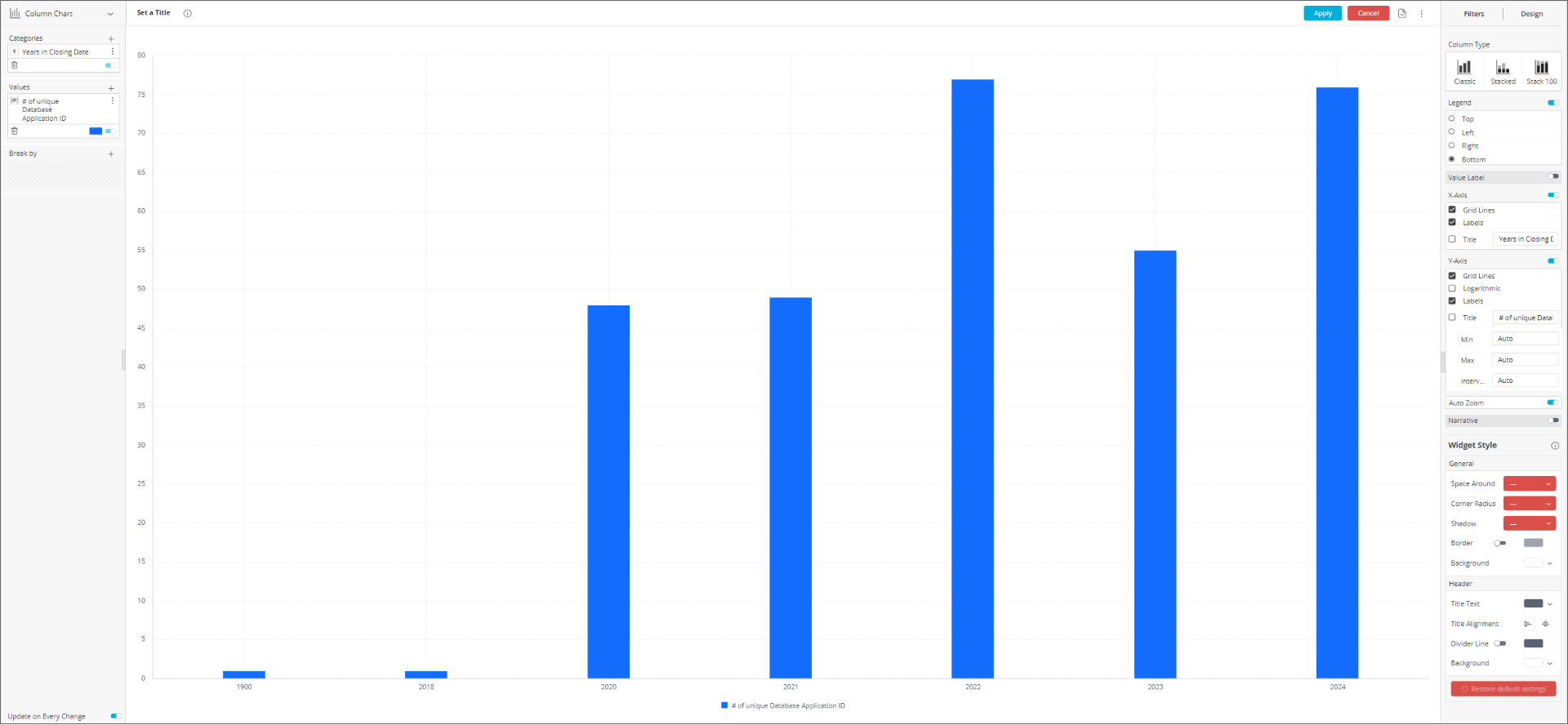
We need to add a Limit To filter to filter out the years (1900 + 2018) which don't have any real submitted applications. To do this, follow and apply the same steps mentioned in step 18 for widget 1 above (Search for and select the Limit To Application filter from the Application (Limit) table).
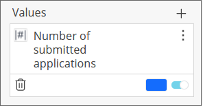
In the Values box, rename the # of unique Database Application ID to Number of submitted applications:
Select the Set a Title at the top, to give the widget a title. Enter Applications submitted per year.
Make any required refinements in the Design tab on the right-hand side, for example moving the Legend from the Bottom to the Top of the chart, and enabling the Title for the X-Axis ('Years in Closing Date').
Select the Apply button at the top to apply the configured widget to the dashboard:
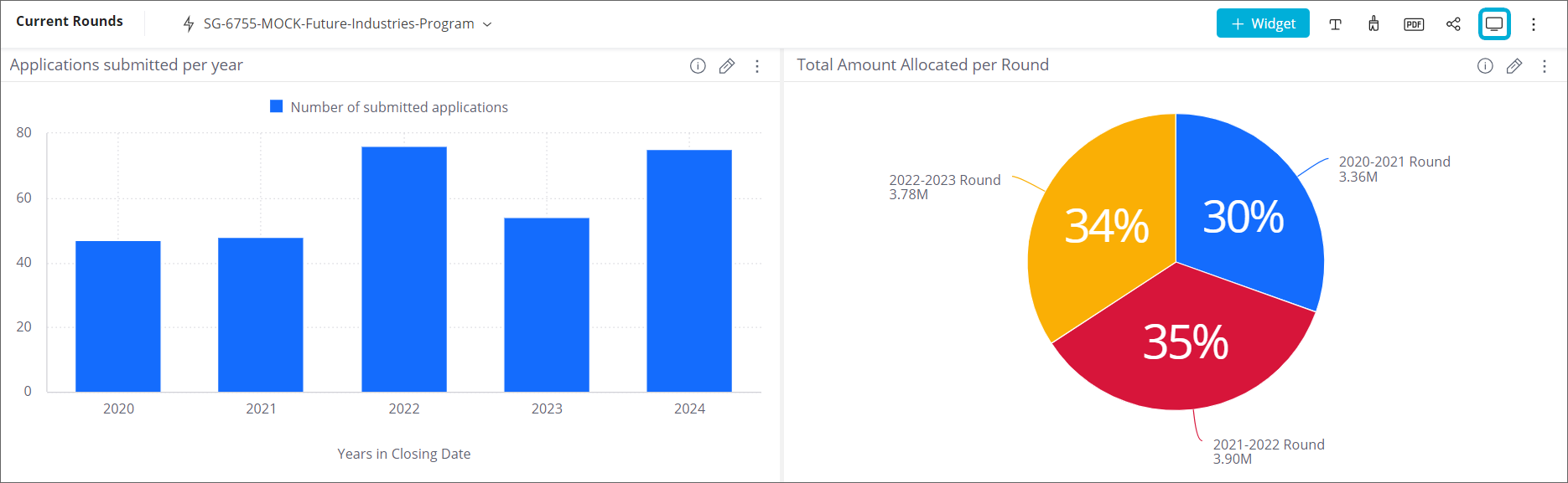
Now there are multiple widgets in the dashboard, you can select the top of a widget and drag it around to organise the widgets as you would like them displayed. You can move the widgets around so they are side-by-side or above/below each other, changing the order. You can also change the width of each widget. All this is possible whilst the dashboard is in Design mode. You can change from Design to View modes by selecting the monitor  icon in the top right corner of the dashboard:
Select the pencil icon to go back to Design mode.

You can continue to add more widgets to build out the dashboard, for example:
Financial reporting
In the data model, financial data is recorded in several different tables: Payment, Funding Allocation, Budget and Application tables. Individual payments are recorded in the Payment table. Payments are grouped by application in the Application Financials table, and they are grouped by budget in the Budget table. To use these tables effectively, you should have a firm understanding of how funding is administered in SmartyGrants. Relationships between the various fields are visualised below:
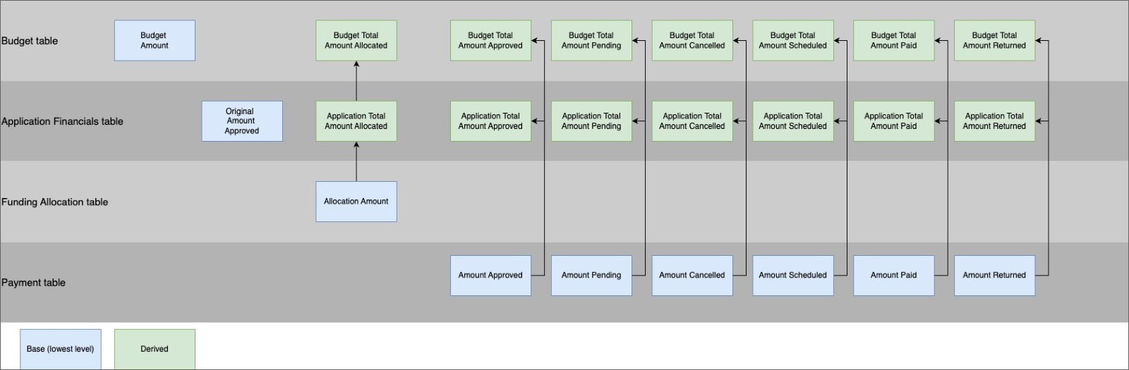
The Payment table
The Payment table contains data around individual payments (i.e. one row per payment), similar to the Payments page in SmartyGrants. Applications can receive multiple payments, which are listed in separate rows in this table:
The Payment table contains payments of all statuses (e.g. scheduled, approved, returned, paid.) When using this table, you may need to filter by status or use the amount columns that have been pre-filtered (e.g. Amount Scheduled, Amount Approved columns).
Funding Allocation table
The Funding Allocation table contains data around funding allocations (i.e. one row per funding allocation). Applications can receive multiple funding allocations, which are separated into separate rows in this table:
Funding Allocation table data comes from the Decision tab of applications:
Application Financials table
The Application Financials table records the sums of payments/funding allocations to each application (i.e. one row per application). It allows us to quickly see the total payments and allocations attached to each application.
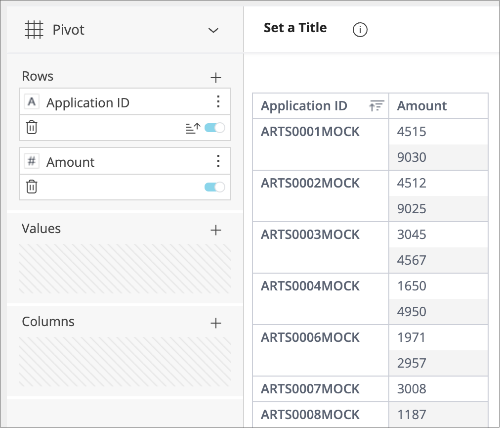
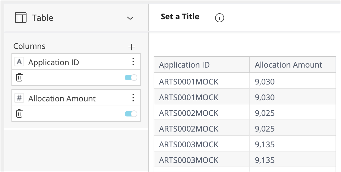
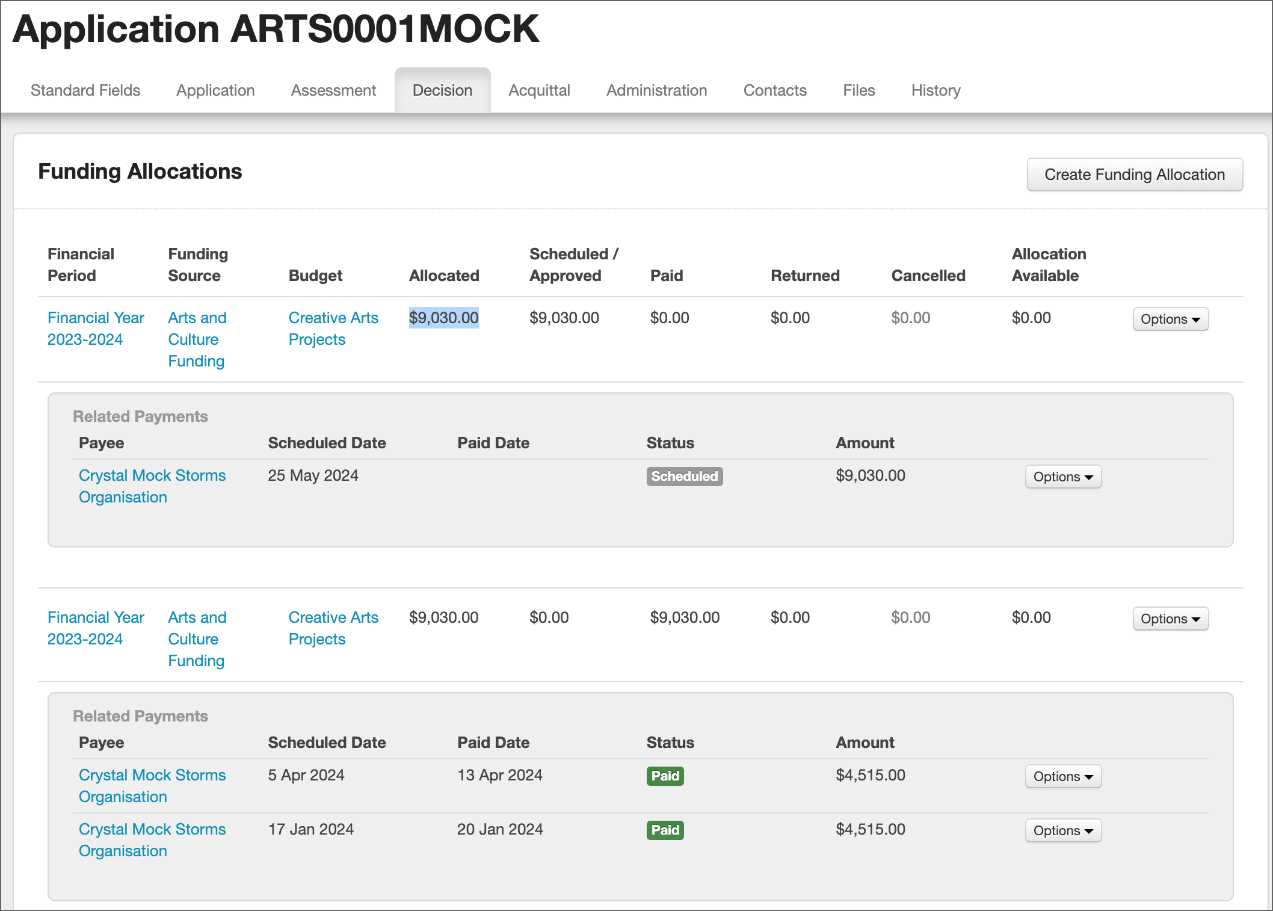
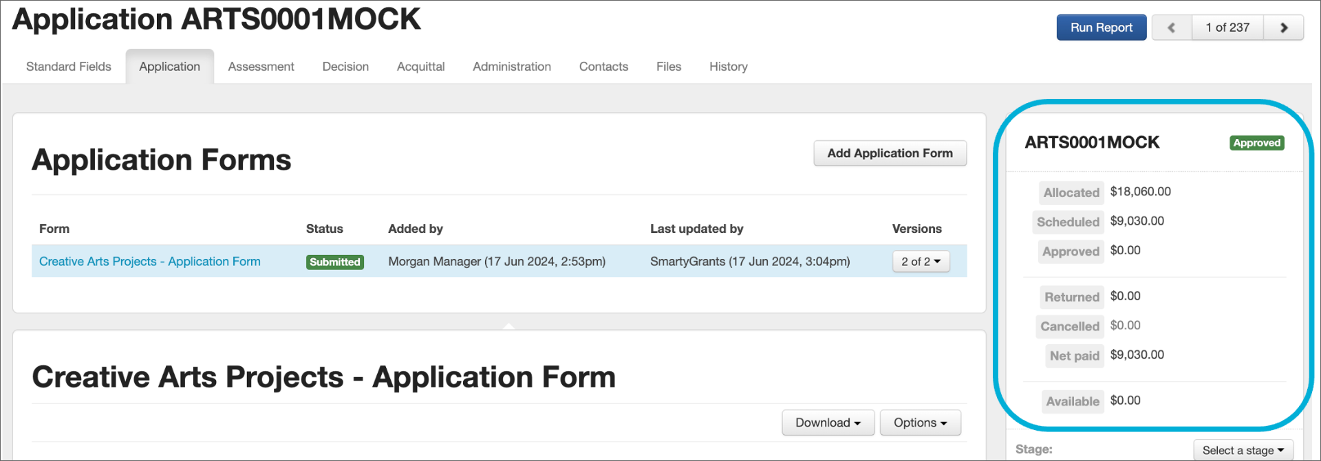
In the images above, we can see that ARTS0001MOCK received two funding allocations of $9,030 which were stored in two separate rows in the Funding Allocation table previously. In the Application Financials table, ARTS0001MOCK has a Total Amount Allocated of $18,060.
Data in the Application Financials table comes from the right-hand summary column of applications in SmartyGrants:
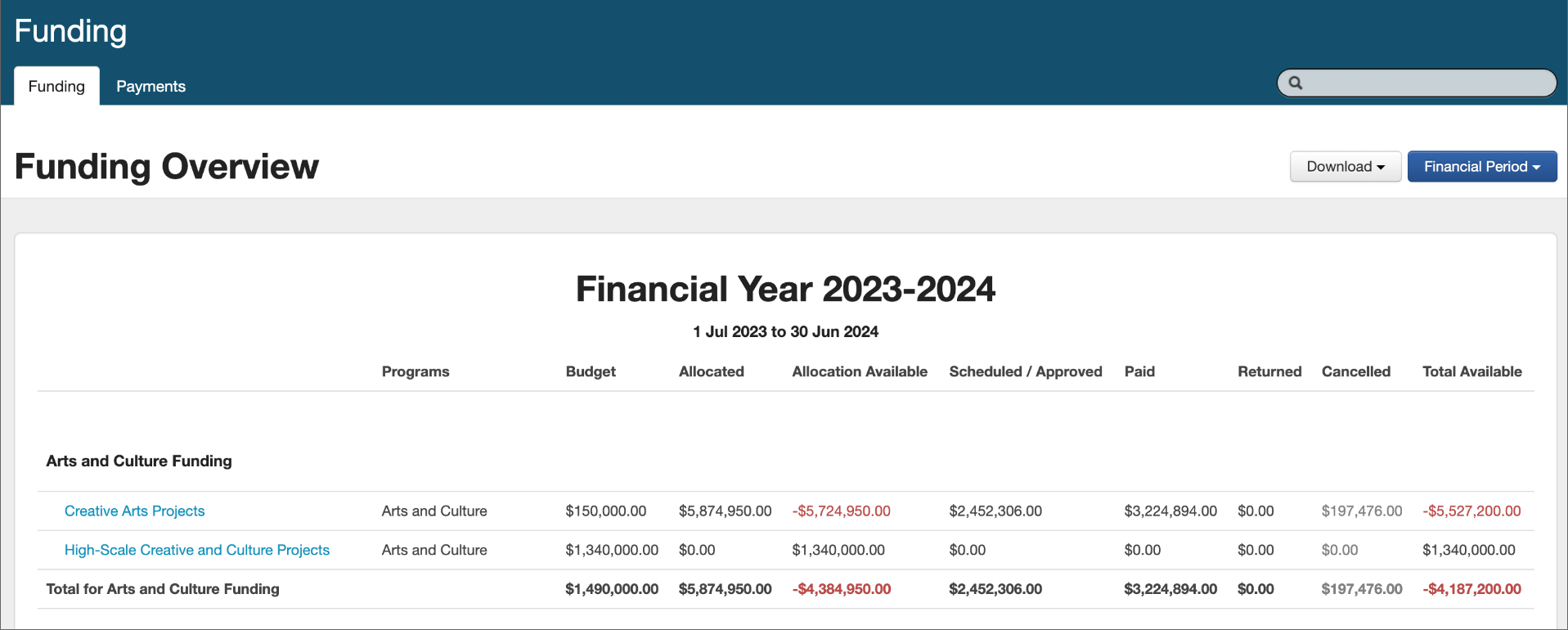
Budget table
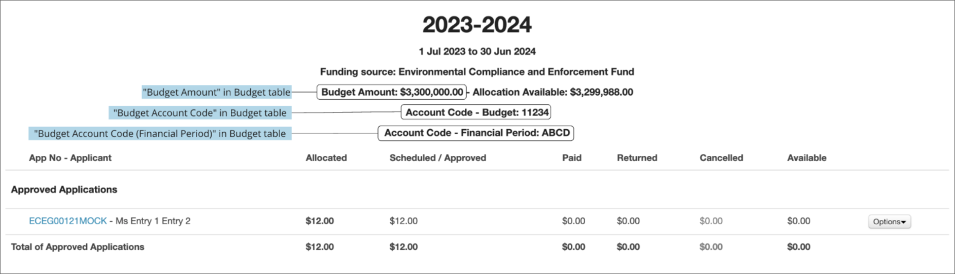
The Budget table contains budget data (i.e. one row per budget). It allows us to see the total payments and allocations that have come out of budgets. Data in the Budget table comes from the Funding Overview page in SmartyGrants:
Selecting a budget in the Funding Overview shows further information also stored in the Budget table:
Financial reporting worked examples
Below are some worked examples demonstrating the logic behind the selection of tables according to financial reporting requirements.
“I would like to find the total amount of funding paid out to each applicant.”
This widget would group funding by application. The Application Financials table is most appropriate here because it sums payments/funding allocations given to each application (i.e. one row per application). The field in the Application Financials table that sums payments is “Application Total Amount Paid”.
It is possible to build out the same widget using the Payment Table (because applications receive payments, payments can be grouped by application).
“Budget Total Amount Paid” in the Budget table is not appropriate for this widget, because this field sums all payments in a budget (and you cannot group budgets by application).
“I would like a list of payments that have been scheduled or approved, but not yet paid out to applications yet.”
This widget would list individual payments in a table (i.e. one row per payment). Only the Payment table is appropriate for this, as payments are summed per application and per budget in the Application Financials and Budget tables and cannot be broken down individually.
“I would like to find the total amount of funding paid out from each budget in this program.”
This widget would group payments by budget. However, it would also group payments by program, and budgets can run across multiple programs. The Budget table may be unsuitable for this analysis, as the field “Budget Total Amount Paid” in this table would give the amount paid from a budget to applications in all programs (cannot be broken down by program).
Grouping a field from the Budget Table by “Program Name” in the Program table does not make sense and when “Limit to Budget” is applied as a widget filter, data will appear blank.
Sum “Amount Paid” from the Payment table instead, which can be grouped by both Program and Budget tables. Payments are paid to an application that can only belong to one program, so this sum would give an accurate calculation of the amount paid from a budget to a specific program.
For more information on this topic including troubleshooting financial reporting, and FAQs, please see the technical documentation attached to the base of this article.
Troubleshooting
Widget shows no results when I add a field
Firstly, confirm that you have data collected against the fields. If this is confirmed, then it is likely that the combination of fields chosen is not compatible. Refer back to the data model.
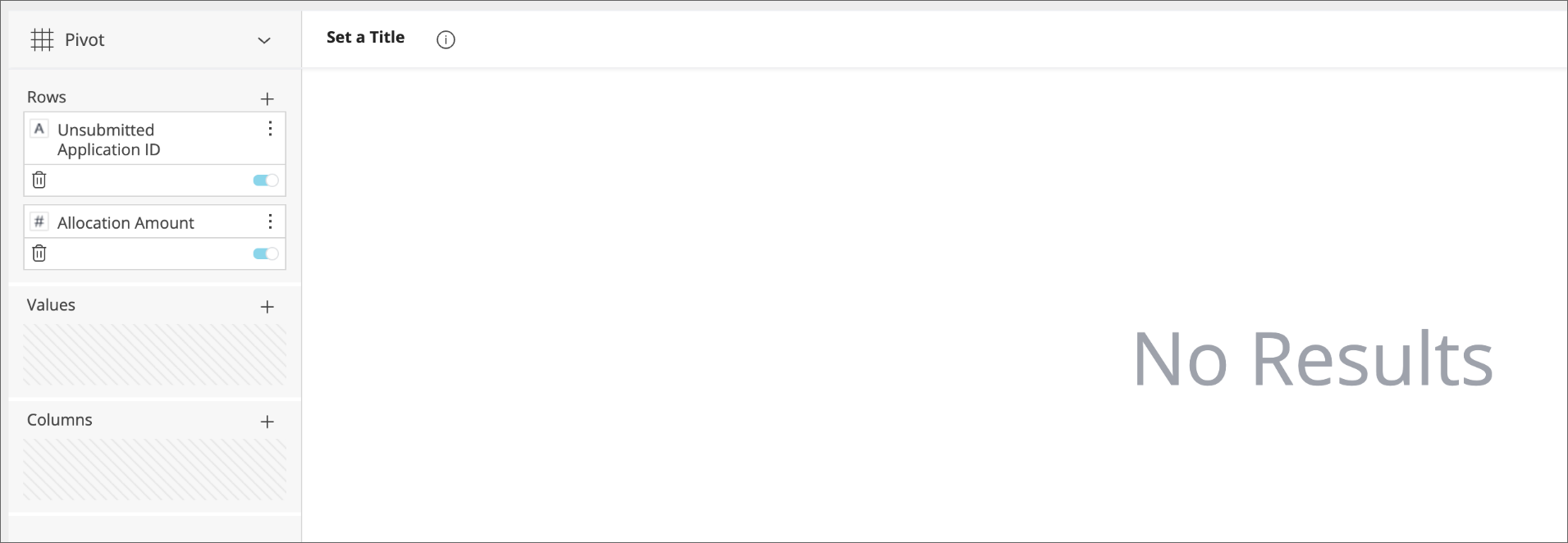
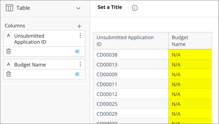
For example, the widget in the image above combines Unsubmitted Application ID from the Unsubmitted Application table and Allocation Amount from the Funding Allocation table. Unsubmitted applications don’t have funding allocations, so it does not make logical sense to combine these fields.
Some columns are blank in my widget
You may encounter a scenario where some (but not all columns) come up as blank in a widget even if there is data against all fields. This usually occurs when some fields are compatible, but one or more are from tables with no logical connection to the previous.
In the example above, the widget is summing Allocation Amount from the Funding Allocation table, meaning that Limit to Funding Allocation from the Funding Allocation (Limit) is applied as a widget filter. When Amount from the Payment table is added to the widget, all rows appear blank. This is because funding allocations do not come from payments, but the other way around.
Consider another example. In the table below, the Budget Name field is from the Budget Period table and the Unsubmitted Application ID field is from the Unsubmitted Application table. There is no link between these tables because unsubmitted applications cannot be allocated funding from a budget:
My widget contains nulls
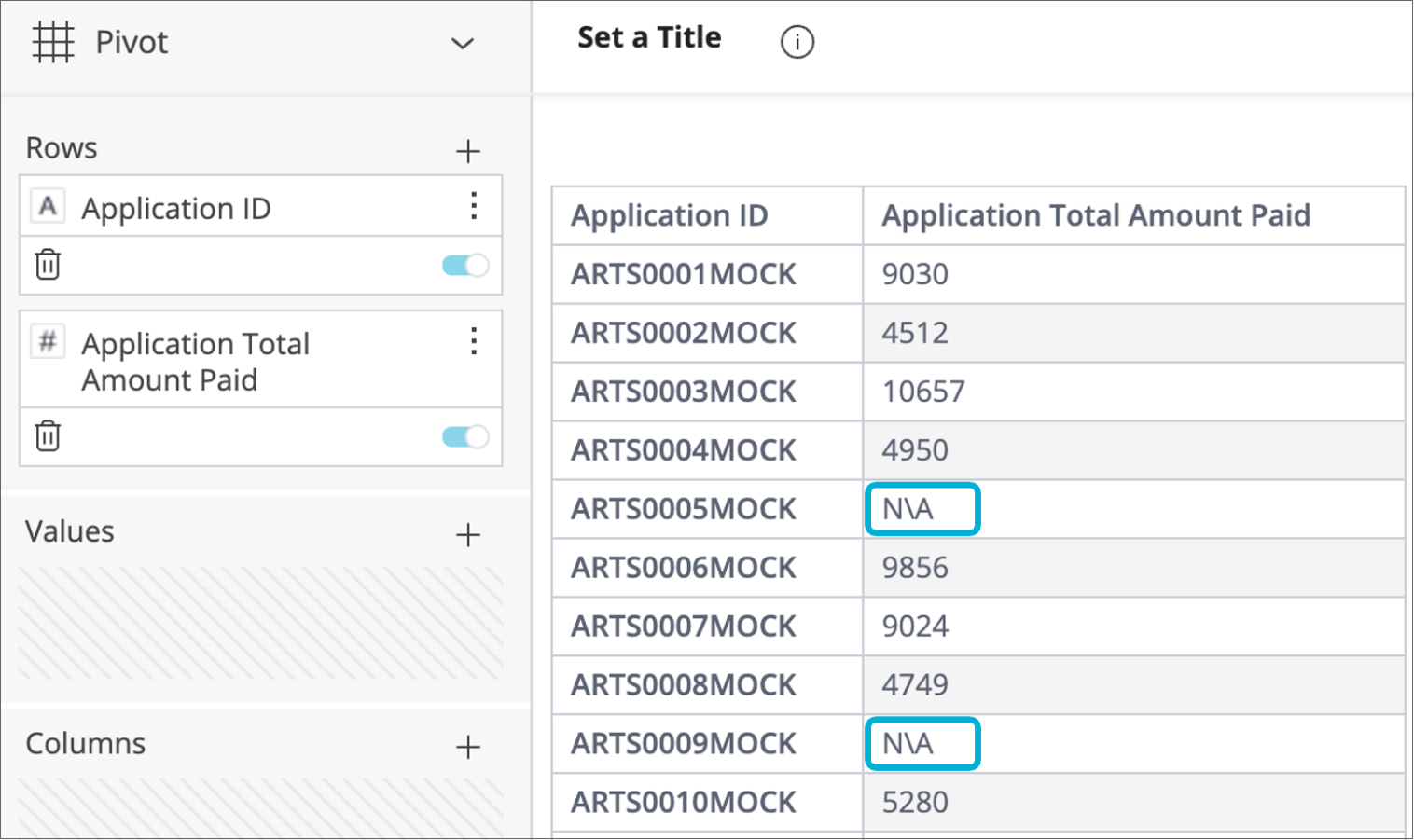
Users may encounter two types of nulls: N\A + N/A (or -1).
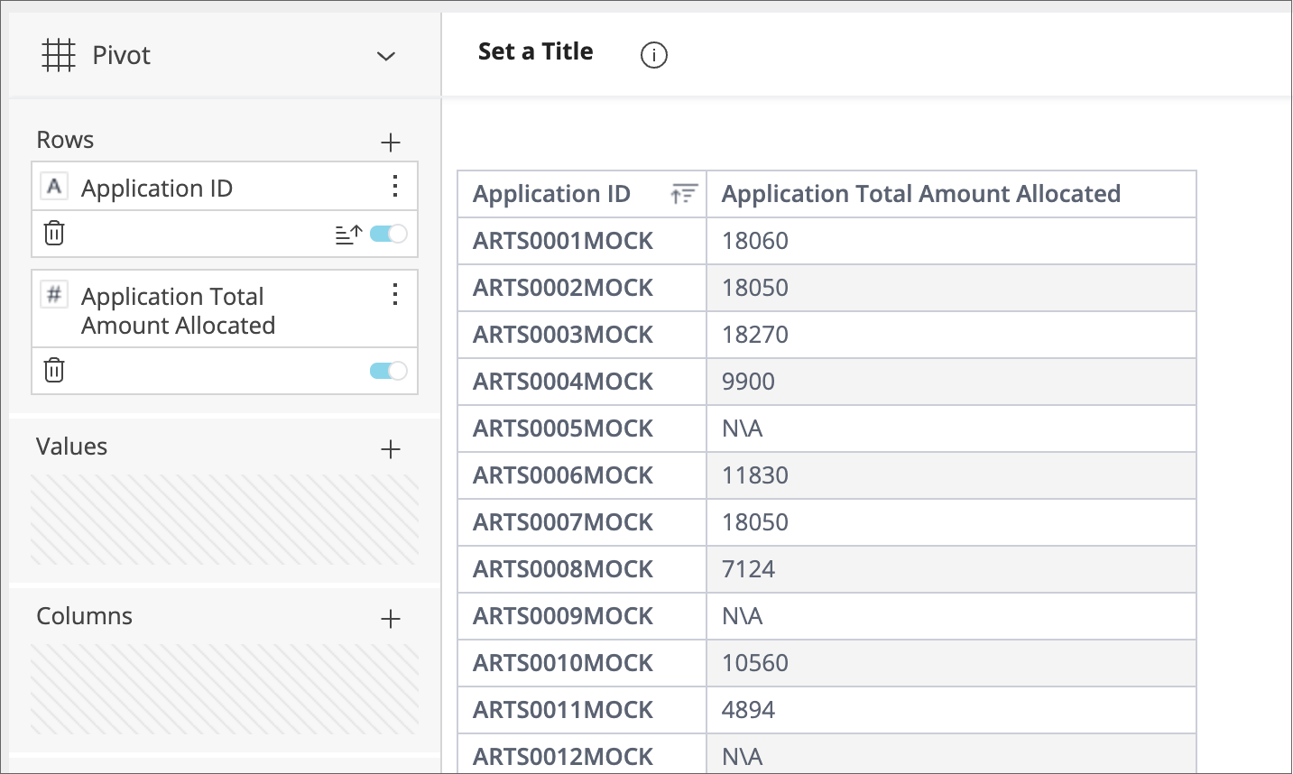
The first type, N\A with a backslash, indicates a blank/empty value; that the field “exists” but was not filled out. In the table below, the ARTS0005MOCK and ARTS0009MOCK have N\A against their Application Total Amount Paid because they are yet to have any payments against them:
The second type, N/A with a forward slash (this N/A will appear as -1, #N/A or <blank> depending on the field and widget type), means that there was no connection between the two fields. Please refer back to the previous heading for further explanation.
Maps
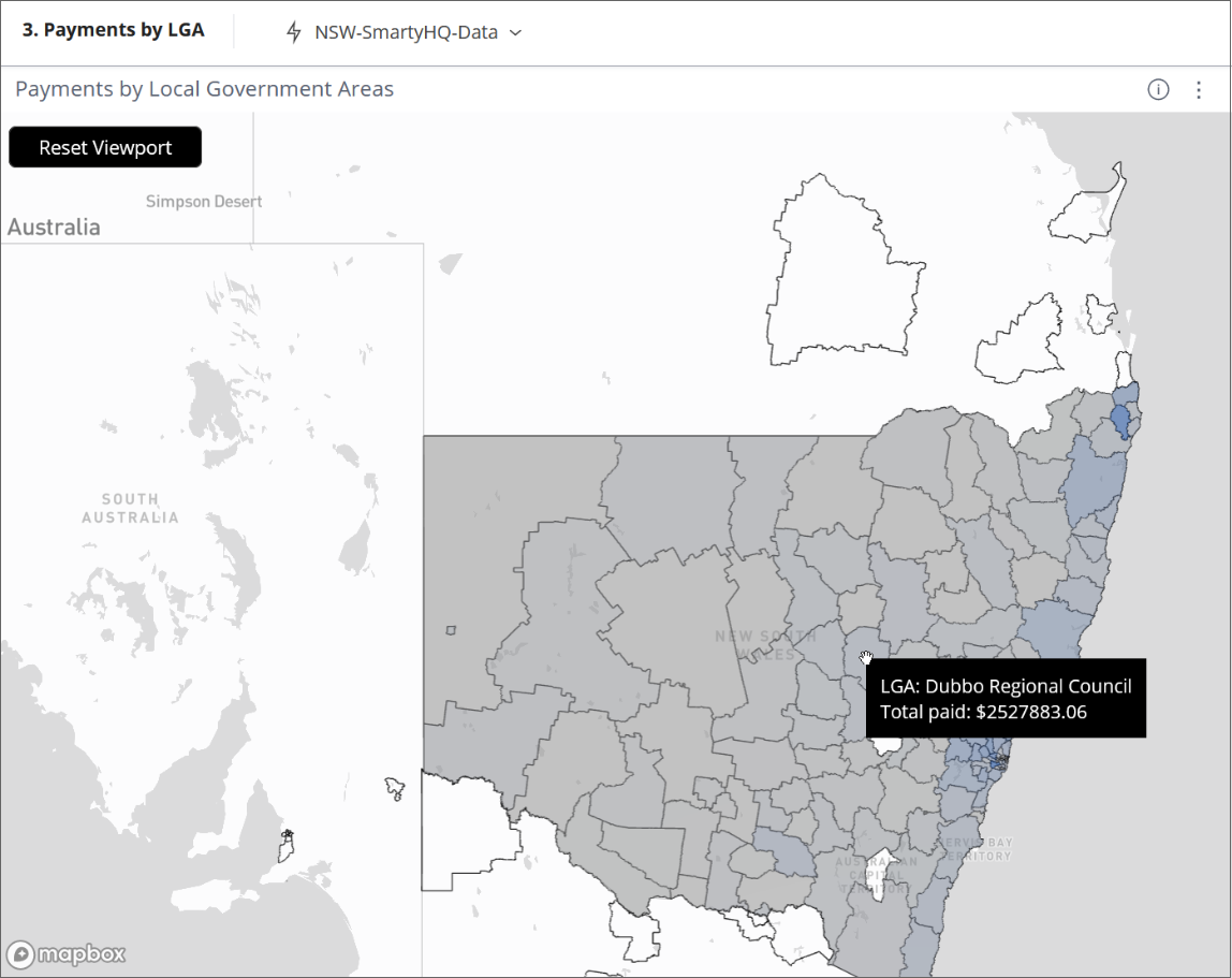
Dashboards can include map overlays, and when you hover over an area overlay it can tell you information about that area, for example:
Creating a map
To create a map:
Firstly select + Select Data to select any attribute (for example Instance ID). This data isn't used in the map but it's necessary to select something in order to be able to proceed to the Advanced configuration and create a map. Select OK.
Select Advanced Configuration.
In the left-hand pane, change the dropdown from Pivot to RAPID DeckGL Maps.
The map will initially return No Results. You need to select data fields for the following for the map to appear:
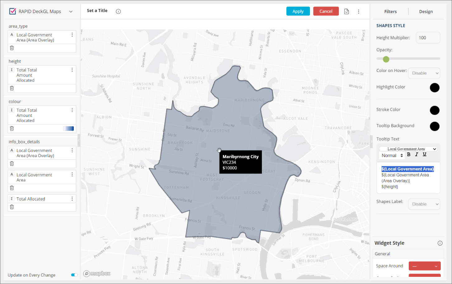
area_type: type overlay and select an area overlay that you want the map to use, for example, 'Local Government Area (Area Overlay)'. The overlay fields are the different boundaries that can be added to the map.
height: this should not be necessary as we are using 2D maps, however currently, you still need to specify something, so add for example 'Total Amount Allocated'.
colour: select an attribute (for example 'Total Amount Allocated'). This controls the colour of the shapes and can be set to a gradient using the values from the field selected to determine the colour. A single colour can also be selected.
info_box_details: add an attribute that you want to be displayed in the Tooltip when hovering over an overlay. You can add multiple attributes (for example: 'Local Government Area (Area Overlay)', 'Local Government Area', 'Total Amount Allocated').
Select Apply.
Select the Pencil icon to edit the map widget again.
On the right side of the screen select the Design tab to configure the look of the map widget:
MAP STYLING:
Map Filter: used for when selecting an area, it applies a dashboard filter.
Map Design: the style of the map (light, dark, satellite).
Dimension: switches between 2D and 3D overlay. With 3D selected, the heights for each overlay are determined by the height field. For now, we recommend users to stick with using 2D.
Warning: The 3D maps don’t have a limit on how high the shapes can be and it's possible for users to set values that result in very high shapes making the map unreadable.
SHAPES STYLE: used to configure the styling for the shapes on the map.
Opacity: used to set the opacity of the area.
Color on Hover: Highlights a shape with the selected colour when hovering over it.
Tooltip Text: used to set what data appears in the tooltip when hovering over a shape. You can select data from the fields used to configure the widget:
area_type
height
colour
info_box_details
You can also enter and format your own text if needed.
Below is an example of a completed maps widget:
Troubleshooting maps
Dashboard filters can prevent the map from loading – if the map is sitting there loading, select Apply to exit the widget editor and then remove any dashboard filters.
If you cannot see the shape boundaries, reduce the Opacity for the shapes.
More advanced information
To learn more about:
The data model;
Designing a widget (with worked examples + Troubleshooting/FAQs);
Entity and Limit tables;
Dynamic tables (including Troubleshooting/FAQs + tables ending in 'Details');
Forms (including the Form Response table, Dynamic form tables);
Standard Fields;
Standard Sections;
Smart Choice standard fields; and
In-depth worked examples,
please refer to the technical documentation attached to the bottom of this article. It can assist with troubleshooting and advanced use cases of the tool.